Website Design can be considered both an art and a science. As designers, we continuously aim to master the balance among visual appeal, user experience, and practicality in our creations. However, in our pursuit to craft the perfect website, we often face numerous design hurdles. These challenges, if not addressed effectively, can lead to a disjointed user experience or even drive visitors away.
In this article, we’ll explore some of the most common layout challenges faced by web designers and provide actionable solutions to conquer them. Let’s dive in!
Responsive Design Challenges

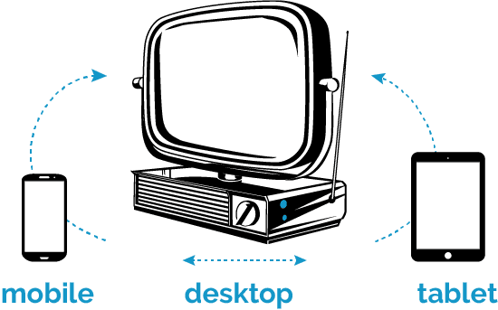
With the proliferation of devices and screen sizes, creating a responsive design is no longer optional—it’s essential. However, ensuring that a website looks and functions well across various devices can be challenging.
Solution:
- Fluid Grids: Adopt a fluid grid system. This means designing the layout in relative units like percentages, rather than fixed units like pixels.
- Media Queries: Use media queries to apply styles based on device characteristics, such as width, height, or orientation.
- Flexible Images: Ensure images resize within their containing elements by setting the max-width property to 100%.
Navigation Issues
A well-structured navigation system is crucial for user experience. However, with the increasing complexity of websites, navigation can become cluttered and confusing.
Solution:
- Prioritize: Not every page or section is of equal importance. Prioritize based on user needs and business goals.
- Dropdowns or Mega Menus: For sites with numerous pages, consider using dropdown menus or even mega menus to categorize and declutter.
- Sticky Navigation: For long pages, a sticky navigation bar that remains visible as users scroll can improve usability.
White Space Mismanagement
White space, or negative space, isn’t just the absence of content. It’s a powerful design element. Mismanaging white space can make a site look cluttered or empty.
Solution:
- Balance: Strive for a balance between content and white space to guide the user’s eye and improve readability.
- Grid Systems: Using a grid system can help maintain consistent spacing and alignment throughout the design.
- Typography: Adjust line spacing, letter spacing, and font size to optimize readability and white space usage.
Overwhelming Users with Too Much Content
While it’s tempting to provide users with all the information they might need, an overload can lead to decision paralysis.
Solution:

- Chunking: Break content into smaller, digestible chunks. Use headings, lists, and short paragraphs.
- Use of Visuals: Replace long blocks of text with infographics, videos, or images where possible.
- Progressive Disclosure: Reveal information progressively. Provide the essential content first and offer more detailed information upon user request.
Inconsistent Design Elements
Inconsistencies in design—like varying fonts, colors, or button styles—can confuse users and appear unprofessional.
Solution:
- Style Guide: Create a style guide that outlines the design principles, color palette, typography, and other UI elements.
- Component Libraries: Use component libraries or design systems to ensure consistent implementation of design elements across the site.
Ignoring Accessibility
Accessibility is often an afterthought, but designing for all users, including those with disabilities, is vital.
Solution:
- Contrast: Ensure there’s sufficient contrast between the text and its background.
- Keyboard Navigation: Ensure all site functionality can be accessed using a keyboard.
- Semantic HTML: Use semantic HTML elements, which can help screen readers interpret the content.
Too Many Calls-to-Action (CTAs)

While CTAs are essential for driving user actions, too many can overwhelm and confuse.
Solution:
- Prioritize: Determine the primary action you want users to take and make that CTA prominent.
- Hierarchy: Use design hierarchy to guide users. For instance, the most important CTA can be a bold color, while secondary ones can be more subdued.
Wrapping Up
Web design is a dynamic field, and challenges are par for the course. By staying updated with the latest design principles and continuously seeking feedback, designers can navigate these hurdles with ease. Remember, the goal isn’t just to create a beautiful website but one that offers a seamless, intuitive user experience. So the next time you face a design challenge, embrace it. It’s just another opportunity to learn, innovate, and excel.
Latest Posts & Articles
Weaving Identity: The Fusion of Brand and Web Design
In the digital realm, a website is often the first interaction a potential customer may have with a [...]
Navigating the Layers: Why Content Hierarchy in Web Design is Important
In the art of website design, the structuring of content is a task that demands careful attention. A [...]
Embracing Flexibility: The Imperative of Responsive and Adaptive Design
In today's multi-device world, a website's ability to adapt is not just a feature—it's imperative. A seamless transition [...]
Crafting a User-Centric Design and Navigation
In the digital landscape, the importance of user-centric design and navigation cannot be overstated. Websites are crafted not [...]


