White – Powerfully Effective Forever

Shine On, You Crazy Diamond!
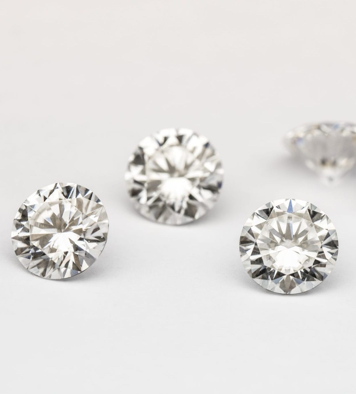
April’s birthstone, the diamond, is more than just a symbol of luxury — it represents clarity, strength, and timeless brilliance. In design and branding, the color white (or the absence of color) echoes many of diamond’s qualities: purity, precision, minimalism, and trust. In this video, we’ll explore the psychology of white and how the essence of the diamond can inspire clean, confident brand identities. Whether you’re building a high-end website or a modern design system, understanding how white space and clarity affect perception can elevate your entire creative approach.
Known almost universally as “woman’s best friend,” a fact not lost on most jewelers in their marketing, the popularity of diamonds is almost impossible to put into words. In honor of the birthstone of April, the so-called “woman’s best friend,” the diamond, let’s look at the color white.

White: The Blank Canvas
White is understandably thought of as a blank canvas, as Bob Ross would attest to. In color psychology, white often symbolizes purity, cleanliness, and new beginnings, representing a blank slate for fresh ideas and a sense of space and clarity. However, it can also evoke feelings of emptiness, coldness, or sterility if overused. Even with that, white is everywhere as it can stimulate a wide palette of psychological responses when used properly. Among those responses, it represents thoughts of possibilities, fresh starts, growth and change. That sense of new beginnings and potential is no doubt one of the reasons Apple uses white in almost all of their logos and marketing.

Diamonds: White in the Rough
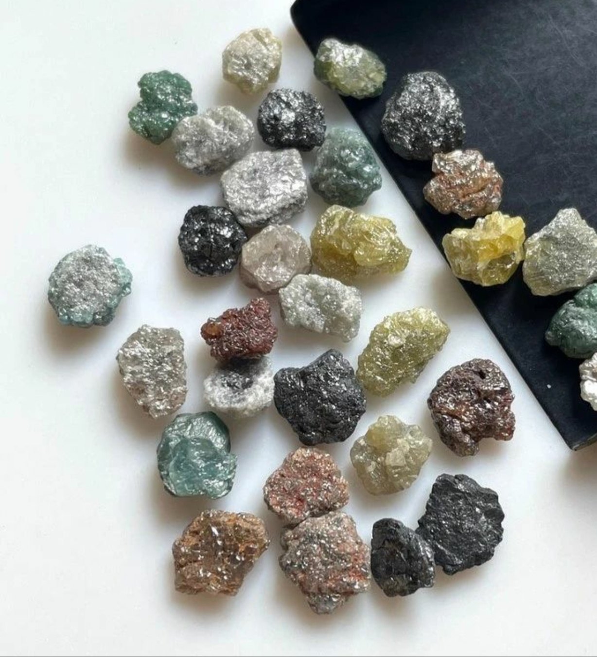
The diamond itself is a great example, as if you went hunting for diamonds at Crater of Diamonds State Park in Arkansas you likely wouldn’t recognize a diamond if you found one since most diamonds don’t look like jewelry diamonds until they’re cut and faceted. White is often associated with purity and innocence — think wedding dresses — as well as balance, simplicity, cleanliness, and clarity. It pairs well with every color in the palette, but it's most commonly used with black to create bold, high-contrast designs that truly stand out. Interestingly, while white diamonds are the most well-known, black is actually one of the rarest diamond colors.

Luxuriously Balanced
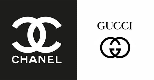
Since diamonds are the ultimate symbol of luxury, consider how brands like Chanel and Gucci use white to convey elegance and contrast in their visual identity. Chanel’s use of a black background makes its white logo stand out with striking clarity. While black can evoke both sophistication and a sense of confinement, the white logo balances it with a sense of calm and refinement. In contrast, Gucci takes a more minimalist approach — using white space to let its black logo shine with understated elegance. Clearly, the impact resonates; after all, “Gucci” has even become slang for something stylish or impressive — as in, “That’s sooo Gucci!”
How about your business? Do you utilize white in your logo and marketing? I would bet that you do. How do you utilize it? As we continue this color psychology in marketing series, look at the colors we cover and various contrasts with a white background from subtle to bold.