Tanzanite: The Psychology of Violet in Branding
Expressive, Elevated, & Intentional.
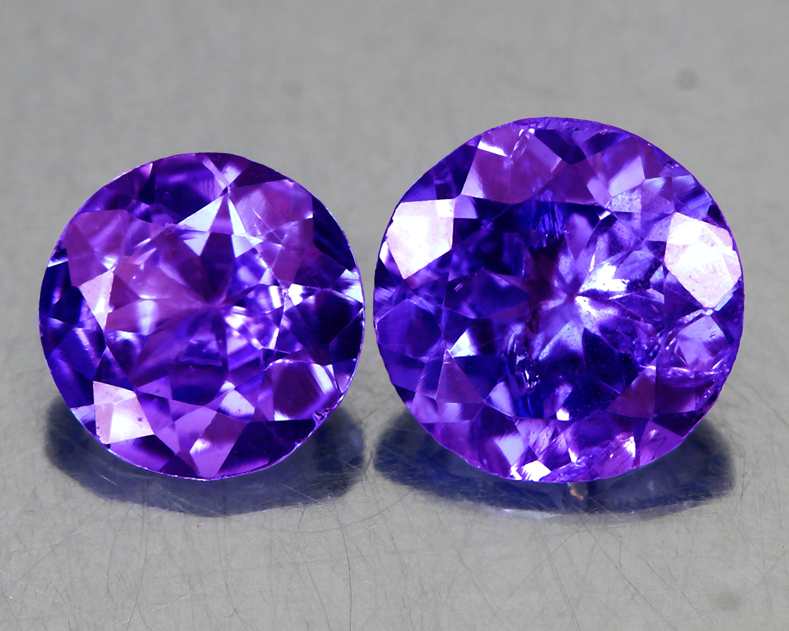
Tanzanite is one of the rarest gemstones on Earth—found in only one location near Mount Kilimanjaro—and its signature violet hue sits perfectly between blue and purple. That balance makes violet a powerful design color: it blends imagination and intuition (purple) with clarity and depth (blue). In branding and visual design, violet signals transformation, originality, introspection, and elevated thinking. It feels creative but intentional, expressive without being chaotic. That makes it an ideal color for brands that want to stand out while still feeling refined and purposeful.
Violet is often associated with:
- Creativity & imagination
- Wisdom and introspection
- Spirituality and transformation
- Uniqueness and individuality
- Premium, thoughtful experiences
Unlike bold purple, violet is quieter and more nuanced. It works well for brands that value depth over flash, and meaning over mass appeal. In digital design, violet performs especially well when paired with soft neutrals, gradients, or subtle motion—creating a sense of discovery rather than dominance.
Use of Violet in Branding: 3 Unique Examples

The Rebrand Before the Rebrand
Syfy’s rebrand leaned heavily into violet tones to visually separate itself from traditional sci-fi and fantasy competitors. Instead of cold blues or aggressive neons, violet reinforces imagination, alternate realities, and speculative thinking. The color supports Syfy’s identity as a space where ideas bend, worlds collide, and creativity isn’t confined by realism. In branding terms, violet helps Syfy signal that its content lives between genres—not fully fantasy, not fully science, but something more experimental and expressive. The result is a brand that feels curious, unconventional, and mentally expansive.
Yahoo! Seriously!
Yahoo’s use of violet is rooted in brand personality rather than luxury or mysticism. As a digital platform centered on discovery—news, search, finance, entertainment—Yahoo needed a color that felt expressive, human, and distinct in an ecosystem dominated by blues and grays. Violet accomplishes that by signaling individuality, curiosity, and creative confidence. From a design psychology standpoint, violet helps Yahoo feel less corporate and more conversational. It supports a tone that says “this is a place to explore” rather than “this is a tool you must use.” The color works especially well in UI accents, illustrations, and motion graphics, where it adds warmth and personality without overwhelming content-heavy layouts.
Stream, Game, Share: Twitch
Twitch’s violet is bold, unapologetic, and deeply intentional. In a space built around creators, live interaction, and individuality, violet acts as a visual shorthand for self-expression and belonging. It distinguishes Twitch from both traditional media platforms and gaming competitors by leaning into a color that feels native to digital culture rather than borrowed from corporate branding norms. Psychologically, violet reinforces creativity, originality, and nonconformity—values that align perfectly with Twitch’s audience. The color also performs well in high-contrast environments, making it ideal for UI elements, overlays, alerts, and live-stream interfaces where immediacy and recognition matter. What makes Twitch’s use of violet especially effective is consistency. The color becomes a unifying thread across app UI, marketing, events, and creator tools—strengthening community identity while allowing individual creators to customize within that framework.
Tips for Using Violet in Branding
When using Violet in your web or branding design:
- Use it as an accent or focal color, not a full saturation wall
- Pair it with soft grays, off-whites, or muted blues
- Violet works well when applied through gradients, glow effects, or motion
- And supported by clean typography to avoid visual overload
Violet is ideal for:
- Creative agencies
- Wellness & mental health brands
- Education & learning platforms
- Tech products focused on innovation or personalization.
Violet isn’t a color that demands attention, it earns it. Like Tanzanite itself, it’s rare, layered, and quietly powerful, carrying meaning beneath the surface. In design and branding, Violet represents transformation, originality, and elevated thinking, making it ideal for stories that invite reflection rather than reaction. When used with intention, Violet creates space for depth, emotion, and identity, reminding us that the most impactful design choices aren’t always the loudest, but the most thoughtful.