Pink — Confident & Emotionally Intelligent
The Emotional Core of Pink
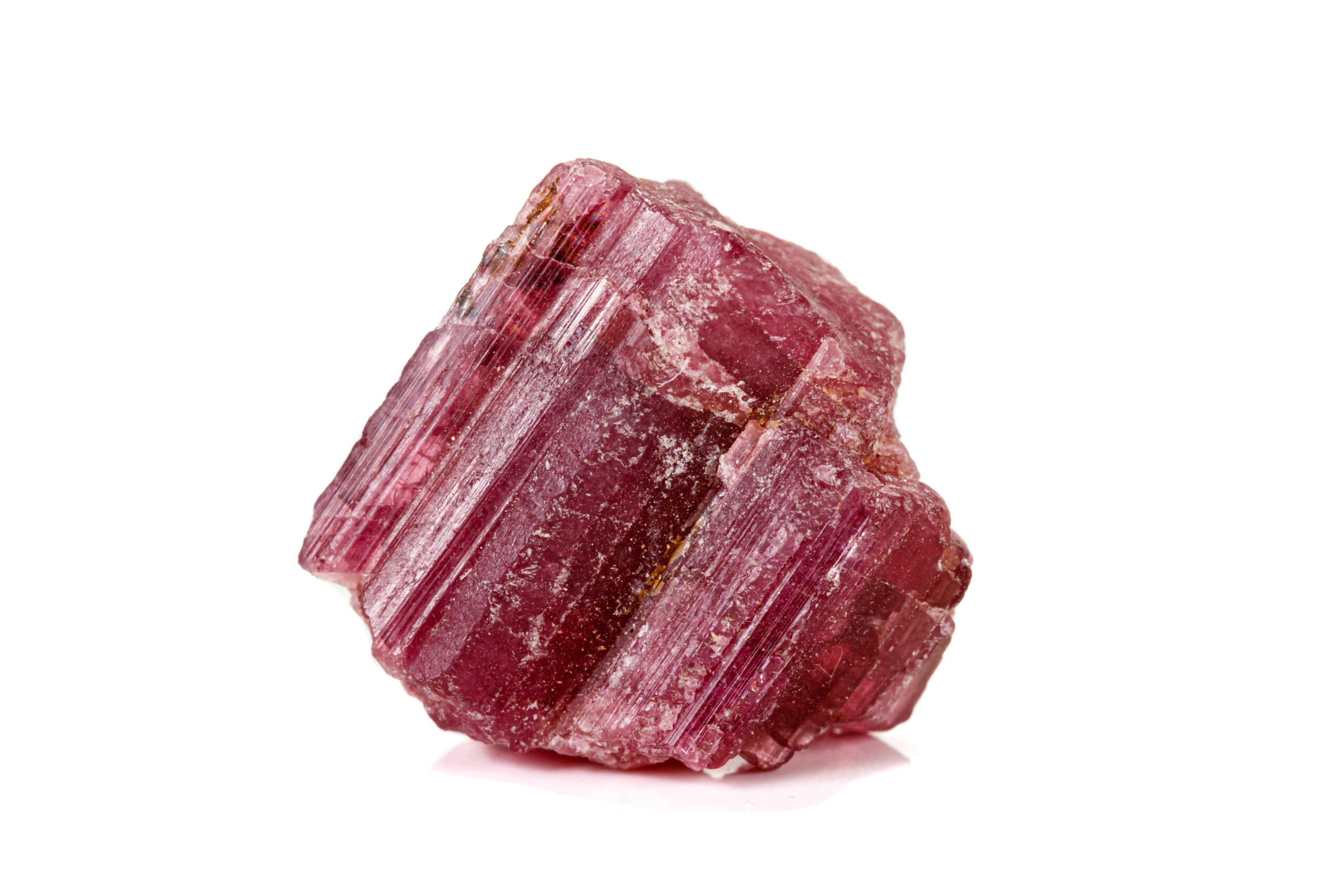
October’s birthstone, Pink Tourmaline, embodies compassion, healing, and emotional balance. Its radiant hue symbolizes love in its purest, most empathetic form — less about romance and more about understanding, care, and connection.
In color psychology, Pink represents warmth, nurture, and emotional intelligence. It softens the harshness of red with a touch of serenity and innocence, creating a tone that’s approachable yet confident. Depending on its saturation, pink can communicate youthful energy, luxury, or calm reassurance — making it one of the most versatile emotional colors in branding.
Use In Branding: 3 Iconic Examples
Feminine Power Redefined
Barbie’s signature hot pink is one of the most recognizable brand colors in history. It evokes confidence, playfulness, and empowerment — perfectly aligning with Barbie’s evolution from a simple doll to a cultural icon representing self-expression and possibility. The color itself became a symbol of feminine power redefined, no longer fragile but bold and unapologetic.
Fun, Flavor, and Delight
This ice cream giant combines pink and rich brown for a modern, nostalgic balance. The pink suggests fun, flavor, and delight, while the brown feels warmer, more authentic, and grounded in heritage — a perfect emotional recipe for a family-friendly brand. Even the “31” hidden in the logo (for 31 flavors) pops in pink, subtly reinforcing variety and joy. Together, these colors communicate comfort and delight with a more mature tone, showing how pink can evolve gracefully while keeping its signature sense of fun.
Assertively Feminine
The vibrant pink of Cosmopolitan’s masthead mirrors its modern, confident, and expressive tone. It’s not shy — it’s assertively feminine, reflecting a brand that celebrates identity, individuality, and empowerment. The pink here communicates both sophistication and bold self-expression, setting it apart from more conservative competitors.
3 Tips for Using Pink in Branding
- Match tone to saturation:
- Soft pink = gentle, calming, nurturing
- Bright pink = energetic, youthful, bold
- Rose or blush = elegant, modern, sophisticated
- Pair with purpose:
- Pink + white = clean and fresh
- Pink + gold = luxurious and romantic
- Pink + black or navy = edgy and confident
- Use pink to humanize:
- For industries like tech, finance, or healthcare, subtle pink tones can make your brand feel more caring and relatable.
Pink Tourmaline reminds us that strength and softness can coexist beautifully. In design, pink is more than a color — it’s a conversation about compassion, creativity, and confidence. It’s the hue of empowered empathy — and it never goes unnoticed.