Emerald – It’s Not Easy Being Green

The Psychology Of The Color Green In Marketing
Emerald, the gorgeous birthstone of May, with a rich history involving royalty not only because of their seductive beauty, but also their mysterious perceived powers. Emeralds are legendary in their royal history and in ancient civilizations ranging from Europe to Greece to Asia and ancient Rome. Add to that the little known fact that emeralds are more than 20 times rarer than diamonds, it’s no wonder the great philosopher Kermit the Frog once mused and sang “It’s not easy being green.”
While green, in some instances, can evoke materialism and jealousy (i.e. green with envy), this pales in comparison to the positive impact green has for the color psychology of your brand and marketing.
Green is obviously associated with nature and growth and is known to represent harmony, luck, health and well-being, tranquility, security and even life itself. Depending on the shade of green, it can be a relaxing color for your brand, evoking a feeling of calm and trust or a feeling of energy and youthful optimism. It’s no wonder that the use of green in the marketing of famous brands is staggering.
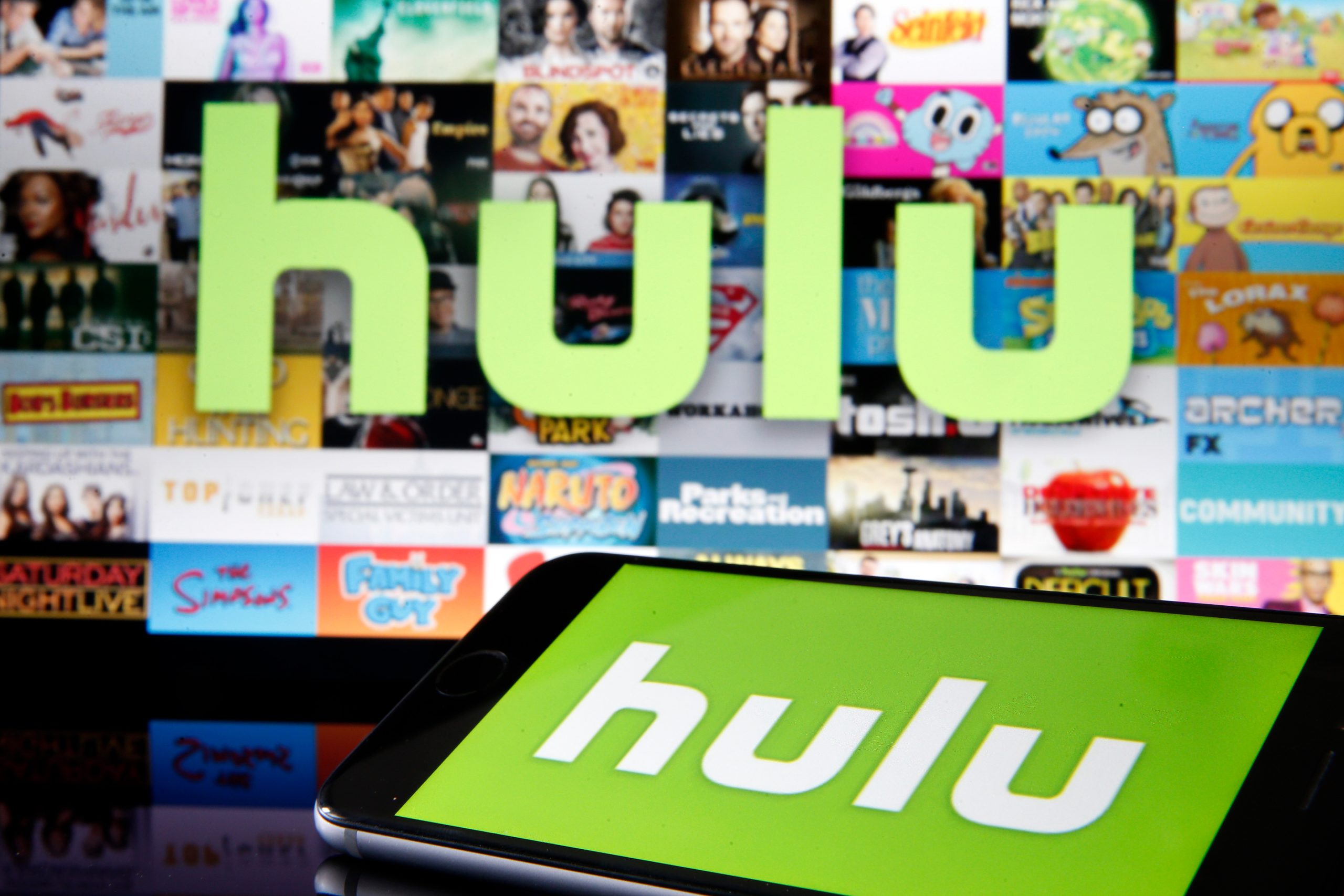
Streamin' Optimism
Take Hulu, for example. This popular streaming platform utilizes green for that sense of progressive and youthful harmony. This ain’t your parents’ TV, this is today…this is the future. No doubt Hulu has made plenty of “green” on this premise. And then there’s Sesame Street, the iconic children’s show that’s been around forever…Not only does the logo utilize a brighter green symbolizing optimism and youth, it includes the happiness and joy factors associated with the color yellow, which we will be discussing in the near future.
Caffeinated Tranquility
Then there is the famous Starbuck’s logo. Where do we even begin? Life, calm and (caffeinated) tranquility, harmony, well-being—It’s not just about the product itself. Starbuck’s started out with the idea of a meeting place… a gathering space for people to drink various varieties of coffee and tea beverages in a comfortable and inviting environment. Their use of green has served them well for a long time and it’s hard to think of Starbuck’s without envisioning their now-iconic logo.
Green to the Extreme
How about Tropicana and Whole Foods? It would have been a travesty if these brands had not incorporated green into their marketing, what with their obvious connection to nature. Life, tranquility, peace, calm, health, a sense of wholeness (pun intended) and stability as both brands have proven consistency and reliability to their clientele. These two brands cover nearly the entire gamut of green in color psychology.
How about your brand? What feelings do you experience when you see the color green in a company’s brand? What thoughts come to mind when you see a website utilizing green in their logo, the site design, or both?
If a logo using green can evoke these emotions and responses, imagine what green could do for your website and online appearance. Is the ever-versatile green the right color for you and your business?