Black – The Power of Versatility in Branding

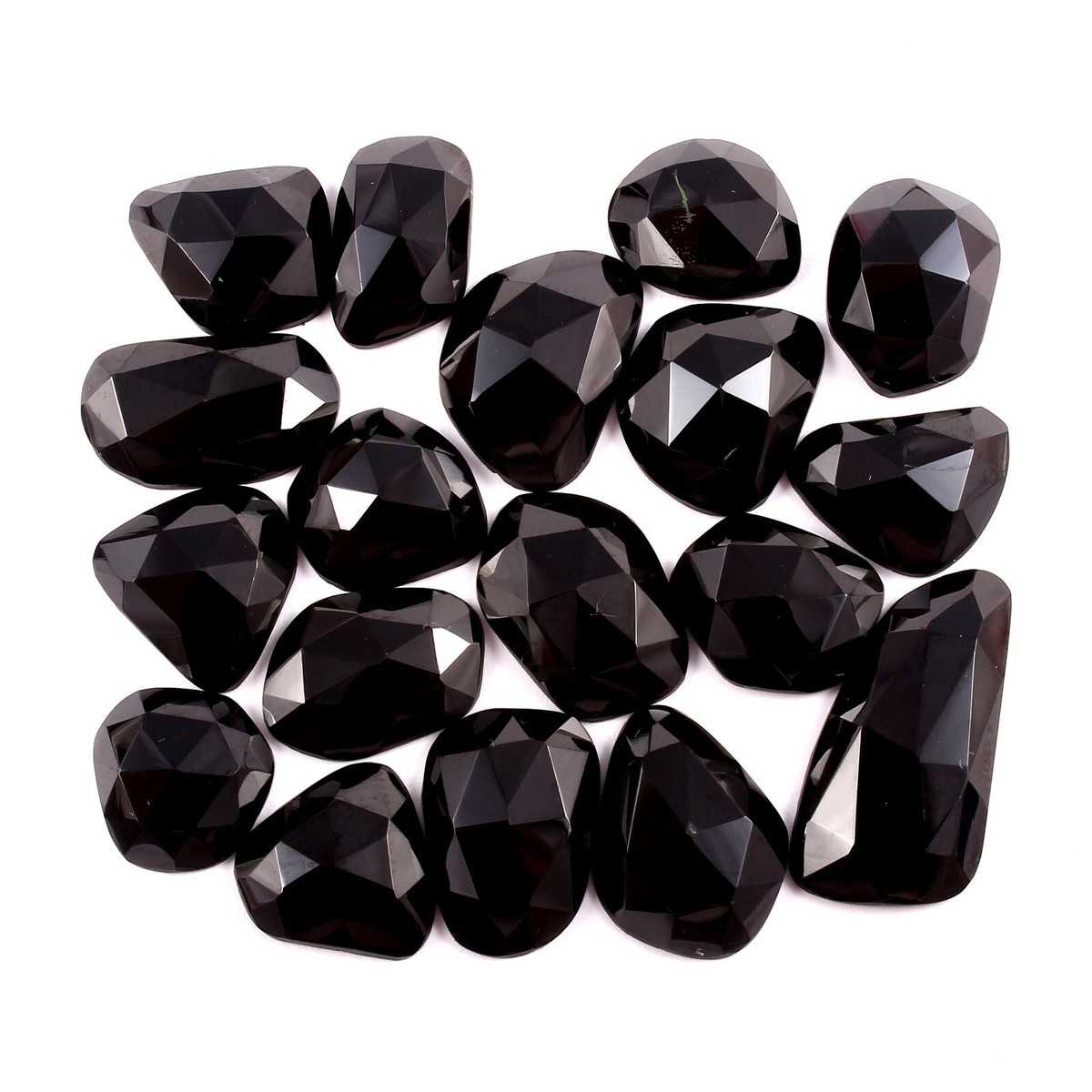
August boasts a diverse range of birthstones, and while Peridot is often the most recognized, Black Spinel offers an alternative that is both modern and timeless. This lustrous gemstone, with its rich, deep hue and mirror-like surface, has long been associated with resilience, empowerment, and sophistication. Its quiet intensity draws attention without overwhelming — a quality that translates beautifully into branding and logo design.
Black: Strength In Versatility
In the realm of color psychology, black is a master of versatility. It represents authority, confidence, elegance, and a sense of mystery. Brands that incorporate black in their logos often aim to convey timelessness, power, and a premium feel. Like the facets of a Black Spinel, black branding can be sharp and commanding in one light, or subtly refined in another, depending on how it’s paired with typography, shape, and accent colors. Black’s dominance in design stems from its ability to adapt across industries and audiences while maintaining a strong visual presence. In luxury markets, black suggests exclusivity and prestige. In the tech world, it implies innovation and efficiency. For personal brands, it conveys intention, focus, and a refined identity. When paired with metallic accents such as gold or silver, black elevates into a high-end, luxurious palette. With bold jewel tones, it creates striking contrast that energizes the brand while keeping its sophistication intact. The qualities that make Black Spinel a captivating gemstone — depth, clarity, and polish — are the same attributes that make black a powerful choice in logo design.

Exclusive and Luxurious
Prada’s black wordmark is a study in understated luxury. The all-uppercase serif typeface paired with the stark black color creates a logo that feels exclusive, serious, and confident. In color psychology, black supports Prada’s brand promise of timeless sophistication and high-end craftsmanship — qualities that resonate globally without the need for elaborate embellishment.

Reliability of an Icon
How about the iconic Adidas logos? The black trefoil and three-stripe variations of the Adidas logo convey strength, reliability, and versatility. Black reinforces the brand’s commitment to performance while adding a sleek, modern edge that works across both athletic and lifestyle markets. The color’s neutrality ensures the logo remains effective whether it appears on minimalist sneakers or bold streetwear collaborations.

Remember the Walkman?
Sony’s black wordmark communicates innovation and authority. The choice of black gives the logo a polished, corporate tone, while the classic serif font grounds it in credibility and trustworthiness. In the context of color psychology, the black conveys control, professionalism, and durability — key traits for a brand that spans entertainment, technology, and electronics.
When utilizing Black with your branding:
- Experiment with Finish: Matte black communicates modern minimalism, while high-gloss black adds drama and elegance — both inspired by the light play on Black Spinel’s surface.
- Prioritize Simplicity: Let the color carry the weight of the brand’s personality by pairing it with clean typography or a single supporting color.
- Maximize Contrast:Use black with white for bold clarity, or pair it with jewel tones for a refined yet vibrant identity.
Like the Black Spinel itself, black in branding doesn’t compete for attention — it commands it. Confident and endlessly versatile, it remains one of the most enduring choices in logo design.